Final Product:

Mock-up

Colour Scheme

I chose to incorporate a colour scheme of white, blue and black. The white connotes clarity, freshness and veracity. The negative space on the article page, also creates a more aesthetically pleasing look overall and allows the reader to focus on the text better. The black font stands out against the white, making it easier for the consumer to read, while also indicating a sense of sophistication and timelessness. The blue from the main image introduces a pop of colour to the entire page, applying the rule of three to the colour scheme, while also connoting confidence, intelligence and trust, suggesting to the target audience, that this article is authentic and well-written by a confident professional.
Article Text
Text on image:
Versace
The label's eccentric summer Pretty Picture featured big celebs walking in works embellished with sleek cuts that flaunted an air of precise elegance. "This collection was unlike what we had ever done in the past."
Says Donatella Versace
The label's eccentric summer Pretty Picture featured big celebs walking in works embellished with sleek cuts that flaunted an air of precise elegance. "This collection was unlike what we had ever done in the past."
Says Donatella Versace
Photoshoot:
Step-by-step production:
Crea Butlin:

|
Step 1:
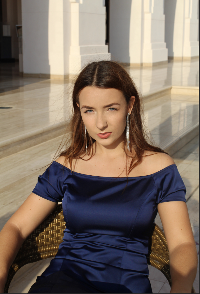
Firstly, I had to chose which photograph to use, I chose to use the same model who was also on the cover and the content's page in order to create synergy, although I style my model in a different outfit and location, to give the impression that this was the model was photographed in several different locations at different times, creating diversity for the target audience, this is a common trope used in fashion/beauty magazines such as Vogue and Elle. Another element of from my research showed me that most photos from article pages in magazines of this genre had high-key lighting, hence my image conforms to this convention. I cropped the original image accordingly to make it fit in a clean, professional way. |

|
Step 2:
I used the patch tool and spot healing brush tool in order to smooth out the skin, and the hair that laid on her chest on top of the dress. I also chose to use the clone stamp tool in order to make sure the retouching didn't result in unnatural looking skin. I then employed the liquify filter in order to conform to the following western beauty standards:
|


|

|
Step 3:
I applied on a new layer, a vibrant pink to the model's lips using the brush tool, to make them stand out more, and then reduced the opacity to 11%, using the brush tool to make the colour look natural. Most if not all magazines feature their models with plump coloured lips; some may argue that this stems from the sexual appeal used to attract a secondary male audience (male gaze - Laura Mulvey); however others may counter that this is an expression of female empowerment where women proud of their bodies are liberating themselves and encouraging other women to feel more confident by showing off parts of their bodies. Moreover, brands targeting a female audience frequently try to sell their products by modeling them through women who conform to western society's beauty standards, appealing thus, to a mainstream audience. Hence, the coloured lips make the model more appealing to the target audience, as lips are considered a sensual part of the body and highlighting them makes the model more attractive. |

|
|
Step 4:
I applied a hue/saturation to reduce the amount of redness on the model, and make the blue of the dress more vibrant and lively. Most models featured in fashion/beauty magazines has little redness in their skin which makes them look more polished and in control, as it gives the impression that they are not blushing and exude confidence, which will appeal to the modern female target audience.
|


|
Step 5:
I used levels to increase the brightness and the contrast lightly. This made the image pop more, giving it more dimension and perspective due to the increased depth of the colours. This also made the model and her dress stand out against the background more clearly.
|


|
Step 6:
I used curves to increase the lightness of the shadows, to make them look more natural. Since my research led me to evidence that fashion magazines often feature images that are key lighted highly but often naturally to make them look softer and thereby appealing to the traditional female target audience.
|


|
Step 7:
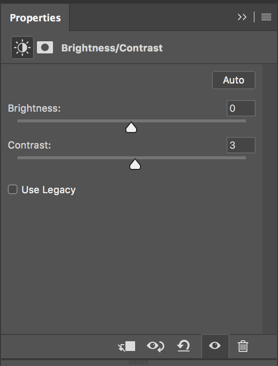
Finally I used the brightness/contrast tool in order to adjust any blemishes in regards to exposure, brightness and the shadows and highlights. I increased the contrast, although the brightness remained unchanged. I increased the contrast to create more depth within the image; as a result of my research, I found that while photos in magazines of this genre had high-key lighting, they also had contrast to makes the image stand out.
|

|
Step 8:
At last I added a text to the top right corner of the image that contained information about the dress worn by the model. This tells the audience that the dress worn by Crea is from Versace's latest collection named "Pretty Picture", giving the target audience the freedom to buy something similar from the brand's collection if they fancy this blue dress gown worn by the model. |
Article:

|
Step 1:
Adding the most eye-catching feature on the page, telling the reader what this article is all about: Crea. The font used here is very similar to the masthead of the front cover. This creates synergy between the two and creates a better flow to the magazine. The one word signifies to the audience that this article is about Crea Butlin. |

|
Step 2:
The rest of the title added above it to give a little bit more context, telling the audience that this article about the life of Crea Butlin. The words "The matter of being" implies that this magazine article got to explore the artist's life by chance, suggesting to the target audience that they are lucky to be reading it. |

|
Step 3:
I inserted the article, splitting it into 3 columns to give a sense of cleanliness, organization and professionalism, the latter emphasized by the plain white background that also connotes the truth and authenticity of this article. This makes the article easier for the audience to read and understand, preventing any distractions. |

|
Step 4:
I then added a quote in italics from the article, to give the reader a good sense of what it was about. This quotes give the audience an idea of the kind of person Crea is, and how this article explores her life. |

|
Step 5:
I employed a page number at the bottom left corner of the page, to help my audience navigate through the article more easily. |

|
Step 6:
Finally I inserted a small black square in the bottom right corner to indicate the end of the article. This is a common trope of article pages in magazines of the same genre, eg: Vogue. |
