Final Product:

|

|
Mock up:

External Images

|
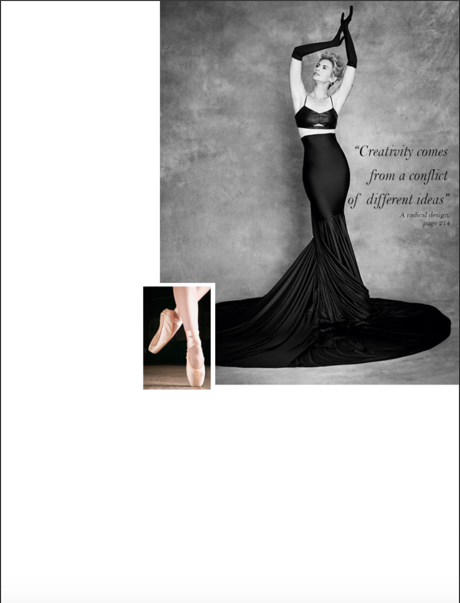
I researched contents pages and found that several of them contained more than one image on the contents page, so I chose to include this one. The woman posing in the black dress makes her look like a trophy or sculpture, adhering to old, traditional femininity: delicacy, elegance and objectivity. However, it can be argued that the woman in the image is expressing her power over the audience by revealing herself entirely through open body language; and it may suggested that this expression of vulnerability makes her come across as empowered, strong and self-assured.
Moreover, the aesthetically pleasing asymmetry will appeal to the my hegemonic female target audience with an artistic taste. |

|
As founded through my research, most Vogue contents pages had the main image from the front cover included under the "Cover Look" section. This is typically done in order to emphasize the featured artist on the cover, on a contents page that does not include the featured artist in it table of contents. Since the contents for such magazines spans over the course of two or more pages, with adverts in between them (these adverts give the magazine a better flow). Through my research I found that magazines of this genre such as Vogue don't feature the artist in their table of contents on the first page, instead including the main image from the cover, mentioning the artist in the table of contents on the second page or later. The latter is conventionally accompanied by an image of the featured artist.
|

|
Model Ola Rudnicka shot by Patrick Demarchelier is wearing a blue leather outfit with blue leather boot and purse. This colour appeals to the subtle colour scheme of the second contents page, in synergy with the blue dress worn by Crea Butlin, and the cyan/blue smoky shades of the perfume bottle. I chose to incorporate this photo to contribute the colour palette and also to have an image of a professional model in a studio environment posing eccentrically in dramatic make up; since this creates a pleasurable contrast against my images of Crea Butlin, the target audience gets a good impression of the artistic diversity of this magazine.
|

|
American singer-songwriter Janelle Monáe is featured on the second contents page in regards to an article in my magazine about the trendy accessory of chokers. Her feature will attract a fan target audience and also add star appeal to my magazine. Janelle is wearing a more simple yet bold choker, which contrasts with what Katy Perry is wearing (look below).
Janelle is at what seems to be a red carpet event, which connotes to the audience that such as simple look is suitable for special occasions, as well as wearing regularly, giving it a diverse range of wear. |

|
Katy Perry is an A-list celebrity and therefore will attract a larger fan target audience. She is also wearing a choker, however her's is considerably larger, more emblished and flashy, this acts as a foil to the chocker worn by Janelle. Together, they create a certain diversity that generates interest among two main kinds of people in the audience: one that prefers a simpler and elegant fashion statement (like Janelle Monáe), and the other that likes something flashier and bolder (like Katy Perry). Katy seems to be captured by paparazzi going out somewhere, which indicates to the audience that they could wear something special out everyday normally, or even for a special occasion. This seemingly diverse wear of the choker may prompt more of the audience into desiring to purchase the product.
|
Production & Post Production
1. Model
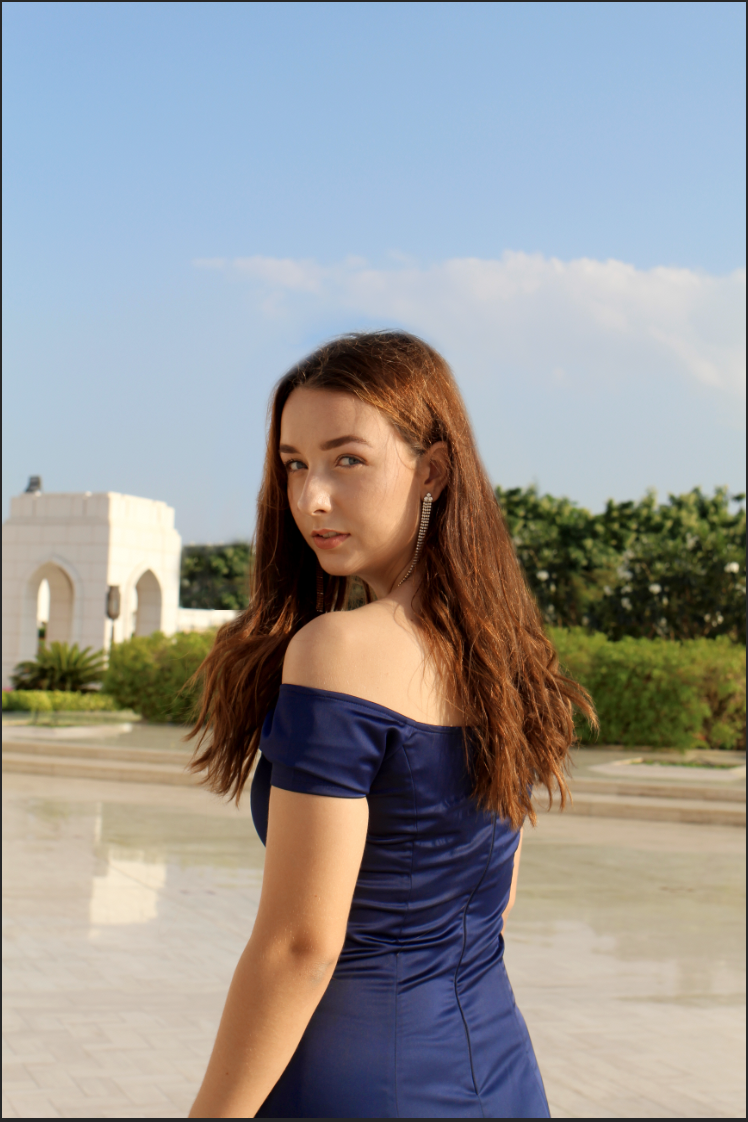
Model: Crea Butlin
Photoshopping:

|
Step 1:
I chose this photo due to the good natural lighting and the model's face was not covered by her hair and I also liked her pose, looking over her shoulder. The photograph was also clear and completely in focus, with the background blurred making the model stand out against it even more. Furthermore, the model has a curious expression on her face, as if inviting the audience to come on a journey with her as she looks over her shoulder, directly addressing the audience. Additionally, the model is wearing a fitting blue gown |

|
Step 2:
Firstly I used the spot healing brush tool, patch tool and the clone stamp tool to retouch the model's face, making her skin look more polished and clear, erasing any blemishes. I did so since models with a clear almost-perfect skin is a common trope in photos in magazines such as Vogue, as I found through my research. |


|

|
Step 3:
Next I used the clone stamp tool along with the spot healing brush tool and patch tool to smooth the models hair, making it look more put together. Most often in fashion and beauty magazines of this kind the models have perfectly put together hair and make up to give the impression that they are in the magazine because they look flawless, and the consumer of the magazine may too look flawless, if they purchase the products used by the model in the magazine. This is a type of marketing strategy wherein the brand uses beauty appeal to target an audience into liking the aesthetics of the products, for example the blue dress has been well-lit along with the pretty model who is wearing it. Since both are aesthetically pleasing, the target audience is more likely to desire what the model is wearing, and how she looks. |


|

|
Step 4:
I applied a hue/saturation layer to a mask on the model in the foreground, reducing the redness of her skin, since this is common in magazines such Vogue and Elle. This makes the model look less flushed and more polished, giving the skin more of a glow through the yellow undertones.
|


|
Step 5:
Here I used levels, which can be used to stretch the brightness levels of an image, adjusting the brightness, contrast and tonal range of the image. Therefore I used the image histogram to increase the brightness and contrast, while maintaining a good balance between both.
|


|
Step 6:
Next I applied curves to increase the brightness of my image, lightening the shadow tones, which helped make the image look more lively and bright. High-key lighting is a common trope of photography in magazines of this genre, hence I used my research in my post-production.
|


|
Step 7:
Finally I used vibrance to bring out the depth of the colours a bit more in order to make my image look more aesthetically pleasing with colour. Since vibrance can increase the intensity of the muted colour without impacting the well-saturated colours, it acted as a fill light for the colours in my image. I used this tool specifically because it prevents skin-tones from becoming overly saturated and unnatural, which was great since it saved me from having to apply it around the model's skin. Vibrance in images in magazine of this genre were also common, as found through my research.
|

2. Perfume Bottle
Analysing Existing Products:
Through my research I found the most typical conventions of product photography concerning perfume consisted of the perfume bottle in front of a primary plain background with little to no details, and the perfume placed in the centre as the foreground. A large number of photos showcased the perfume to posses some other-worldly qualities; below are some examples of this:
|
This McQueen perfume seems to be located on another planet, which connotes to the audience this product of out-of-this-world and therefore, unique. The purple land underneath the perfume also looks like it's cracking, this imagery may suggest that this abandoned purple planet is harsh and nearly impossible to survive, but the perfume is strong enough to survive on this planet on its own, even though it is an inanimate object, implying to the audience that this product is reliable, strong and long-lasting and also worth their money. This perfume is the only presence in this environment, creating the impression that this is a revolutionary product, the first of its kind, making it original, authentic and appealing to a target audience of explorers and aspirers. The more conventionally feminine colours such as pink and purple will also appeal to a female target audience.
|

|

|
This perfume by Hugo Boss, is a more simple example of product photography, however it still remains the main focus of the image; the bottle and liquid perfume inside it transcending gravity. This connotes to a target male audience that this perfume will make them stand apart from others, and raise them up, socially, emotionally and mentally. The liquid inside is tilted even though the bottle is, which suggests to the audience that this perfume, while remaining sophisticated (as shown by the straight bottle elegantly rising above the palm of someone's hand), also has a personal flair, that makes it unique, making it worth the consumer's money. The more blue undertones in this image indicate a male audience as blue is a conventionally masculine colour. Furthermore, the slight desaturation further gives the impression of masculinity, along with the shape of the bottle looks similar to that of a beer bottle, a drink often traditionally associated with men and masculinity.
|
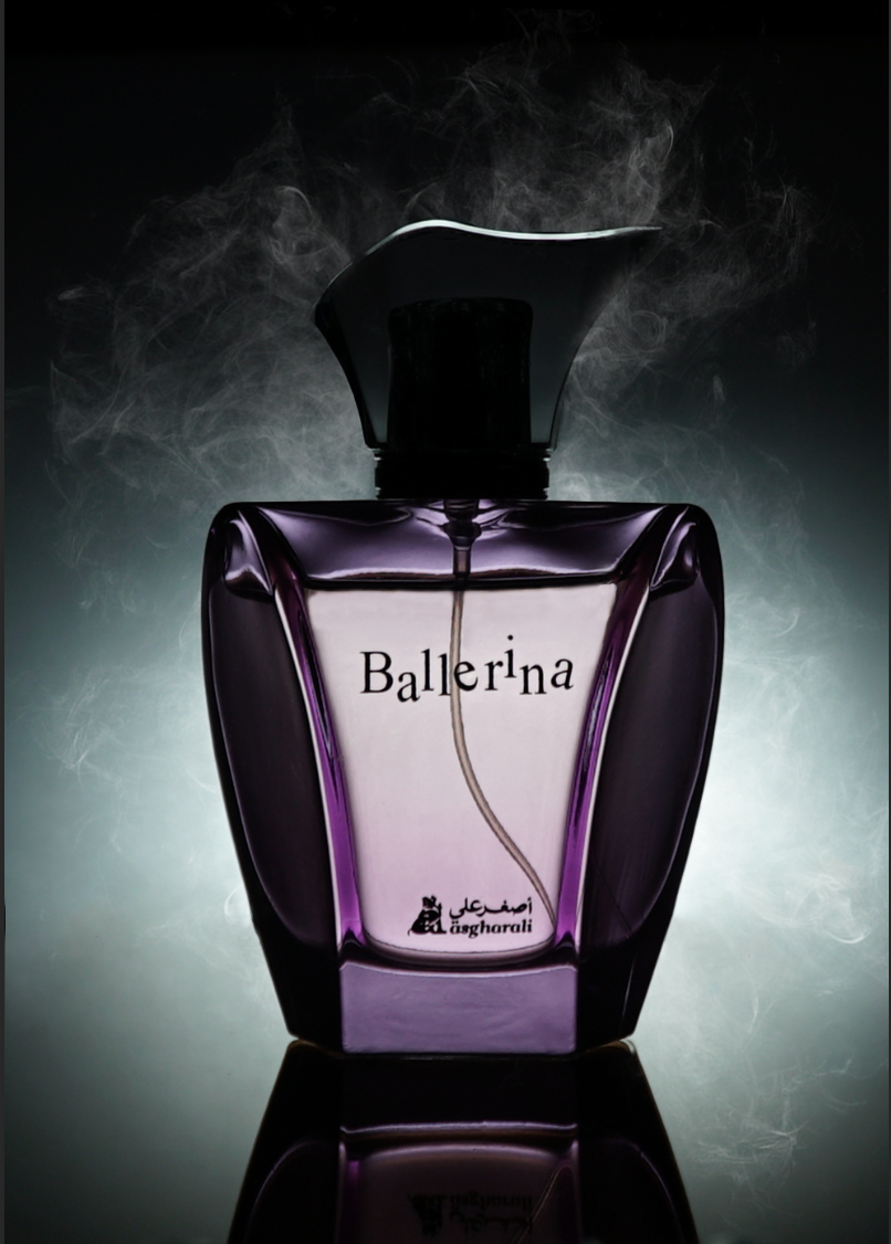
Photography: I took this photo by placing a strong white light behind a roll of parchment paper, in order to create a softer look, while placing the perfume bottle on a dark reflective plate. I set my camera to a lower aperture, higher ISO and lower shutter speed on a tripod to avoid blurry photographs.
Photoshopping:

|
Step 1:
I choose this photo due to how sharp it is; the bottle is approximately in the middle of the light and the shot, creating a perfect symmetry. There is also enough space around the bottle for me to play with in Photoshop. I then cropped the image to change its orientation to portrait. |

|
Step 2:
I rotated the image to make sure it was aligned perfectly in the centre. I then used the spot healing brush tool and the patch tool to smooth the background, making it look seamless. I also used the clone stamp tool to carefully remove the plate, as to make sure only the reflection was all that would be left of it. Then to make sure the image looked more professional and mysterious, I used the burn tool along with the clone stamp tool to darken the bottle cap, so that the metal wouldn't reflect the light. This created an enigmatic silhouette for the perfume bottle as whole, making it look more professional. |


|

|
Step 3:
I imported an image of white smoke in front of a completely black background. I placed the smoke onto my main image and used the free transformation tool to rotate it to my liking, reducing the image's opacity to 57%. Then I change the blending mode on the layer to Screen, which made the smoke seamlessly blend into the image. |


|

|
Step 4:
I made 5 more copies of the same smoke image, using the transformation tool to place each one at a different angle and position on top of my main image. I reduced the opacity of each smoke image to below 60% and changed the blending mode to Screen for each one. I placed all the smoke in a folder and switched the layer visibility off to work on masking out the perfume bottle from the background to place on top of smoke layers. |


|
|
Step 5:
I used the Magnetic Lasso Tool to make my selection of the perfume bottle, using Select and Mask to refine my selection. I place the bottle over the smoke to give the impression that the perfume bottle was literally hot and steaming, which would translate metaphorically with the target audience: the message that this product is fresh in the market, popular and gives the consumer some form of sexual appeal. the mysterious low key key lighting gives a sense of mystery, which has for a long time been associated with sex appeal, sophistication and trendiness. |


|

|
Step 6:
I duplicated my perfume bottle mask layer and using the clone stamp tool, burn tool, spot healing brush tool, patch tool and sharpen tool to make the edges of the bottle sharper and darker |


|

|
Step 7:
I applied a hue/saturation layer to change the colour to blue in order to make my image conform to the colour scheme of my contents' page, in synergy of the main image of Crea Butlin in the top right corner. Blue is representative of confidence, calm and trust, which will connote to the target audience that this is a reliable product that will make them feel confident and relaxed.
|


|
Step 8:
Next, I employed another hue/saturation layer, this was copy of the previous one. This helped make the image look even more vibrant, enhancing the colours further, turning the image more a more pleasant cool blue.
|


|
Step 9:
Then, I used another hue/saturation layer to intensify the colours, as I found through my research that product placement images in magazines such as Vogue have vibrant colours that grab the audience's attention. |

|

|
Step 10:
I used a brightness/contrast as it allows the user to make simple adjustments in the tonal range of an image. So, I used this tool to increase my image's brightness and contrast, since my research on product placement images found that the name of the perfume always stood out so that its branding was obvious to the audience. However, with more high-end and well-known brands, the name of the company is typically larger than the name of the product itself; this is done because the product of that brand is not necessarily always better than others like it. The company is selling their brand image and ideologies along with their product. Therefore, customers will often buy more expensive products that work just as well as cheaper options, simply because the expensive brand can be seen as a symbol of status, power, luxury and guaranteed quality. Hence, since the perfume brand I chose isn't as well known as, say Homage, then the name of the product "Ballerina" is of more importance than the brand "Asgharali". Most large brands start out with a special product that gains them their fame, then the company learns to grow with it audience, all the while holding their original product as a symbol of their brand, eg: Chanel No.5, which is an iconic perfume by the brand, although now they have a large array of other perfumes, even though they still hold this classic perfume as a symbol of their success as a brand. Another great example would be the J'adore perfume by Christian Dior. |

|

|
Step 11:
I used levels since this is a tool which can be used to move and stretch the brightness levels of an image histogram. It has the power to adjust brightness, contrast, and tonal range by specifying the location of complete black, complete white, and mid-tones in a histogram. I applied this to my image in order to give a more vivid clarity, so that there was a slightly greater contrast to make the words on the perfume bottle stand out, therefore making the brand more obvious to the audience. |

|

|
Step 12:
I also employed another levels layer to adjust the tones of my image to brighten, add contrast and shift colours, making the image more vibrant. I did this because from my research I found that there was a certain balance between high key and low key lighting in product photography, with the centre of focus having high key and the area around it being low-key, this is a common trope of product placement images in Vogue magazines. |

|

|
Step 13:
Finally, I utilized curves to adjust the tones of my image to brighten, add contrast and shift colours, making the image more vibrant, while also adding a dark vignette around the image to create a more centralized perspective, establishing the perfume bottle as the main focal point. Making the product the centre of attention is necessary convention of product photography. |

|
Contents Page Step-by-Step Production
Page 1:

|
Step 1:
I started out with a blank page, using my mock-up as a guide to placing conventions on my first contents page. I used a size of 12x16 cm, which is the standard for magazines. I chose a white background as the colour connotes purity professionalism and perfection, allowing me to create a clean and fresh design. This will also allow my audience to clearly identify and read the content. The lack of colour also helps make sure the contents page does not have a distinct colour scheme, so the rest of the magazine can employ as much colour as needed and the different articles and adverts can include their own colour palettes, without having to conform to a certain colour scheme or theme throughout the entire magazine. This allows for continuity throughout the magazine, making it easier for the audience to read it while also creating a sense of class and perfection. |

|
Step 2:
I inserted the black and white image of the woman in the top right corner of the page, using the free transform (ctrl+T) tool to resize it to fit. I made this the main focus point of this contents page, catching the reader's eye and also giving the consumer an idea of the genre of this magazine. This will make it easier for them to decide if they are interested in a magazine of this genre, seeing as this main image connotes high fashion, beauty and a female target audience. |

|
Step 3:
Here I added an inspiring quote from one of the featured articles in my magazine, adding a small byline below it and placing both on top of the image, which connotes to the audience that this image is in relation to the quote. So the target audience may be attracted to the article either by the quote or image. I also placed the article title and the page number, so that the reader can easily refer to the page number when trying to find that article. I italicized the font to give a classier and more sophisticated look, matching the style of the image. |
|
Step 4:
Next, I added an image of a woman dancing with pointe shoes, with only the shoes in view. I also added a white border around the image to separate it from the larger one. The smaller image of the pointe shoes creates synergy between the main image on this content page and the main image on the from cover, deriving the black and white from the large image and the yellow undertones from the cover. |

|
Step 5:
I added the header "contents" in all caps and the same font as the masthead. This helped create synergy between the two platforms: contents page and front cover. I changed the justification of this text to create a more asymmetrically artistic aesthetic which would appeal to my target psychographic with an interest in different types of fashion, design and styles. This justification also makes the header stand out from the rest of the table of contents to which I wanted to give a left justification to. |

|
Step 6:
I added the table of contents, with a left justification and a category heading which will help my audience identify what sections of the magazine they might want to skip ahead to, according to their interests, eg: regulars, Elodie trends, jewelry, lifestyle, etc. I chose to employ a small serif typeface (Bell MT) with curved ends that made the text appear more feminized, appealing my female target audience. The categories help the magazine look more organized and also saves the reader time looking for content about a certain topic such as beauty, trends, lifestyle, etc. I chose a small font for the contents not only because it adheres the the contents pages of Vogue magazines, but also because it provides my target audience with a lot of information about the contents of this magazine. My target demographic of A-C1 is most likely to have received a higher education and therefore are likely to appeal to a more sophisticated presentation of larger amounts of information. This also gives the impression that the reader is getting a bang for their buck with a lot of quality content. I followed a certain formatting with the text: the headers are italicized, while the rest of the text is regular; each numbered article is followed by sub context in a smaller font size, providing the audience with more context relating to the article. This type of in-depth information in small fonts encourages the audience to read the contents and helps the magazine target those with a genuine interest in fashion. The page number for each article is placed first, so the reader can easily refer to it as needed. I created two columns for the sell lines to create a clean, professional look, with careful use of negative space on the page to appeal to the target audience. This helps keep the text organized in a similar way to news articles. This creates a sense of trust and reliability within the audience towards the magazine as it reminds them of newspapers that are dedicated to informing and entertaining the audience, like this magazine. |

|
Step 7:
I inserted the main image from the front cover into the bottom left corner with "COVER LOOK" as the heading, indicating to the audience that this contents page belongs to the magazine issue with this main image. Combined with the other two images, this contents page is able to give the target audience a good idea of what will be featured in this magazine: fashion, accessories, hair and make up (Crea Butlin). At a quick glance, a reader is able to determine whether this magazine is of any interest them just by looking at the 3 images that dominate the page. |

|
Step 8:
I added a small reference to the article and the page number of the article underneath the image of the pointe shoes. This will help the audience find more about the article in relation to this image. |

|
Step 9:
I added information about the main image on the cover page. The text includes information about the model and her clothing, make up, hair, jewelry and the photographer. Research showed me that often the model on the front cover of a magazine will be endorsing the brands that have been used in order to make her look like she does on the cover; and often the publishing company is more concerned with trying to sell the brands and their products rather than trying to sell the artist herself. Brands pay the publishing company (eg: Vogue) to use their products during a photoshoot, and also to have their brand name appear in the magazine. So fans of the artist will be attracted to the idea of using the same products from the same brands as the artist featured in the magazine. Since this is a high-end magazine, I featured expensive luxury brands such as Christian Dior and Cartier; this also a typical commodity of fashion/beauty magazines. I also mentioned the stylist, hair dresser and photographer, all of whom have the largest impact on the final image. Finally I added two small details: the page number and the small line of reference to model in the black and white image (concerning her outfit, accessories and the brands participant). The latter is a common trope of contents pages of fashion magazines. Every image featured in such publications has some kind of reference point for the reader, just incase he/she finds something in an image interesting and desires to purchase it or find more about it. In such high-end magazines nearly everything in front of the reader's eyes can be purchased; hence big brands pay large amounts just so that their products can be featured in the magazine, and this where most of the magazine's income comes from. |
Page 2:

|
Step 1:
Yet again, I started with a black page, using the mock up as a guide to my design. I chose white to maintain synergy and good continuity between the two contents pages. |

|
Step 2:
Firstly, I placed the main image in the top right corner, spanning over a large portion of the page. This photograph featuring the featured artist helps maintain synergy throughout the magazine, connecting the front cover, both contents pages and the article page through synergy. This allows for the magazine to have good continuity and a better flow for the reader. I left a small amount of space between the edge of the page and the border of the image in order to create a more asymmetrical aesthetic appealing to a target audience interested in visual vocabulary and design expression through my magazine and the fashion in it. The artist as shown in this image also appears on the article in the same blue dress, which furthers the concept of continuity. The model directly addressing the audience encourages the latter to read the contents, inviting them to explore the magazine and the featured artist in it. |

|
Step 3:
Next, I placed an image of a woman wearing a high-end and expensive-looking outfit, posing against a blue wall. This creates synergy with the other image of Crea, and the perfume bottle I later placed on the page. These two images are representative of the often lack of diversity within magazines and the fashion industry. I deliberately chose to employ caucasian models in order to emphasize the minorities that are often under-represented in the fashion world. The younger population that looks up to giant publication companies such as Vogue may often find that their race, ethnicities and nationalities are misrepresented or not represented at all. This image will appeal a target audience with interest in fashion and/or modeling. I also added a white rectangle covering small portions of the two images to makes space for more images. |

|
Step 4:
I added two image of Janelle Monáe and Katy Perry who are both A-list celebrities and wearing chokers, this may attract fans of the celebrities, while adding star appeal to the magazine. This is placed in reference to an article about chokers and perhaps their popularity in recent years. High-end magazines such as Vogue are often "trend setters", meaning the publication often contemplates different and specific items of clothing and accessories and since it often has cult-like following, is able to launch fashion trends. Therefore, this will attract a target audience interested in fashion and accessories and the two celebrities in the images. Both artists are an unlikely pairing, and hence will further raise curiosity among the target audience (enigma codes). I cropped a small part of the image of the model in blue (leaning against wall) to make more space for the table of contents. |

|
Step 5:
The last image I added was this one of a perfume bottle, appealing to a target audience interested in cosmetics and perfumes as well as luxury brands featured in fashion magazines such as this one. Through my research I found that often consumers are more likely to buy something if they have seen it featured in magazines such as Vogue and Elle. |

|
Step 6:
I added a quote on top of the image of Crea Butlin with a small reference underneath it. This infers to the audience that this is direct quote from the artist, which raises enigma codes within the audience, prompting them to read the article; and with the reference they'll be able to easily navigate their way through to said article. I also employed more reference to the images of the two celebrities and the perfume bottle featured on the page. Since research has shown visual imagery to engage an audience more deeply, the images will prompt the reader's interest in their articles, wanting to find more about the images (enigma codes raised). I chose to employ the same typeface for the quote and reference as on the previous page to maintain synergy and continuity, helping the magazine remain easy to read, understand and professionally clean. Furthermore, through research I found that contents pages of such magazines featured subscription information for the reader, usually including a free gift as a reward for subscribing, or a complementary gift to attract and persuade the consumer to sign up for a monthly subscription. The audience may also be tempted by the "free" aspect of the gift. According to a study published in the Journal of Marketing, consumers are more likely to buy a product (eg: make up) is it comes with an unknown free gift. So much so that it can double the purchase likelihood. Hence by mentioning a free gift, without mentioning what it is, is more likely to prompt the reader to purchase a monthly subscription. I also added a page number to help the reader navigate throughout the magazine. |

|
Step 7:
Next I added a short line along the edge of the left side of the page giving the audience information about the model in blue (leaning against the wall) and her clothing and accessories. As I explained beforehand, this allows the audience to access the products in real life that they see in magazines such as this one. |

|
Step 8:
Additionally, I inserted the table of contents using three columns to organize the text in a clean, professional and aesthetically pleasing design. I followed the same format I employed on the first contents page to maintain synergy and continuity, making it easier for the audience to read and understand the text clearly; again I made sure to organize the text according to category and included several of the "ON THE COVER" articles. The latter helps the audience navigate their way more easily through the magazine, seeing as the target audience may be attracted enough to one or two cover lines in particular to purchase the magazine. |

|
Step 9:
Finally I placed the "Contents" header in full caps aligned to the right edge of the main image of Crea Butlin. This type of design helps to create a different perspective for the reader: since the format of this page is quite similar to that of the first page, this unconventional alignment helps break up a uniform format that may bore the target psychographic with interests in fashion and design. |
