FINAL PRODUCT:

Choosing A Name
I researched names for girls that have important connotations. Also research words related to beauty, fashion and lifestyle, mostly from Greek, Latin and French backgrounds. I have derived most names from Latin and French, due to their great influence on the English language. I have also used names with French origins since the country has an iconic reputation for romance and glamour: the latter being a part of my brand’s ideology. Thus, my magazine name will allow my company to clearly engage with its mature female target audience, helping them identify (Blumler and Katz) with my brand and its ideologies.
- Elodie
- Verity
- Illicit
Elodie
Derived from French, via the Old Germanic phrase, “foreign riches”, this mellifluous name connotes wealth and heritage. The former implies to the target audience that they will become rich, prosperous and affluent if they read my magazine, while the latter suggests primordial tradition, culture and eternity: relating my company’s ideology of publishing authentic and iconic content. The name was also given to a Spanish Saint in the 9th century (derived from Alodia) , making my magazine classic and timeless; thus, Elodie carries a classy and mature tone which will resonate with my target audience aged 16 - 30. The name carries a distinctly feminine flavour, making it suitable for my female target audience. Elodie is a short name, consisting of only three syllables that makes it easier for my target audience to recall, recognize and identify with. The simplicity of this name will appeal to my mature female target audience that is likely to have a sophisticated sense of style, beauty and fashion.
Verity
Stemming from Latin via Old French, this word translates to “truth”; indicating to my target audience the sincerely fundamental importance of my magazine. It also implies my company's authenticity and exclusivity, appealing to my target audience of explorers who seek individualism and admire difference. Connotations of Verity imply to my target audience that my magazine is giving them true and accurate information they will not find from any other source, making my brand reliable and dependable; this will allow my brand to to build a fanbase of faithful and devoted readers that will grow exponentially. It will also lead an increasing trust between my magazine and its audience, allowing my target demographic to freely identify (Blumler & Katz) with my company and it ideologies, and forming relationships with fellow readers of Verity. The feminine character of this name makes it suitable for my female target audience. Verity is a noun connoting eternal truth, thus signifying my company’s authentic timelessness and class, which will resonate my mature female target psychographics of aspirers and succeeders, aged 16 - 30. Since Verity is similar to Vanity, it may prompt my target psychographic (that reads magazines such as Vanity Fair and Vogue) to be reminded of the iconic magazine Vanity Fair; indicating to my audience that my magazine shares the same quality of the popular publication.
Illicit
With connotations of exclusivity and forbidden natures, this word originates from the old language of Latin. With only two syllables, my target audience will find this name easy to recall and recognise. The raffish and rebellious implications of Illicit will appeal to my target psychographic of explorers; however, it may repel traditional, conformist mainstreamers, thus, I remain more impartial to this name over the other two. Nevertheless, Illicit indicates a secretive, sophisticated and exclusive atmosphere that will be inclusive of all readers, and implies to my target audience that they are a part of my brand: as if they are members of a community, helping them build relationships (Blumler and Katz) with fellow avid readers of my magazine. According to HuffingtonPost.com.au, 4 in 5 women have low self-esteem, therefore, my female target audience will be able to feel included by Illicit magazine, which resonates with my brand’s ideology of inclusivity and diversity. The word Illicit insinuates my company’s authenticity and veracity; this will prompt the audience to candidly connect and identify (Blumler and Katz) with my magazine and its contents, encouraging individualism and diversification within my female demographic.
Collecting Evidence - Market Research
I conducted a survey of 20 females aged 16 - 40, to see which name they would prefer for a fashion, beauty and lifestyle magazine. The results came back as shown in the chart below:

Since most of my target audience chose Elodie, I will use it to represent my magazine and its ideologies.
Mock Magazine Cover
Initial idea: 1st Mock-up

Analysing Typography

OPTION A
|
Bodoni 72 Smallcaps Book:
This serif font connotes timelessness and sophistication, as this typography is more classic and traditional. Due to this age of this type of font, it is often associated with romance, elegance and formality. Therefore, this font shall appeal to my female target demographic. Moreover, this typography bears resemblance to other established publications belonging to the same genre as my magazine, such as Vogue, Vanity Fair, Elle, etc. Henceforth, seeing as my target demographic isn't unlike that of these magazines, this serif font will appeal to my target audience, due to their familiarity with its typeface. Additionally, this transitional serif font has a traditionally feminine structure, with the letters stretched to create a more slim and sleek design, emphasizing its elegance and delicacy. However, the typeface also stands out, appearing bold and strong, subverting traditional values associated with femininity to create a more empowering modern outlook on the concept. Hence I chose to employ this font style since it fell in line with the ideologies of my magazine and its brand. |

OPTION B
|
Velocity - DEMO:
This sans serif font gives my target audience the impression that the text has been personalized for them, thereby allowing them to engage more throughly with the text. This typography looks like a signature, which will make my magazine seem more exclusive; since signatures are used by people to represent themselves, placing it on the cover as the masthead will make the audience feel as if they are being included into an exclusive and personalized group, making them feel more special. Therefore, this will fall in with the ideology of authenticity my brand chooses to employ. However, the font does not look entirely sophisticated or traditional, and hence may not appeal to my largest target psychographic group of mainstreamers who tend to value security, domesticity and conformity, although it may appeal to explorers, aspirers and reformers. Moreover, the typeface has a more traditionally feminine style due it cursive, thin, slanted and smooth appearance, which will appeal to my target female audience. |

OPTION C
|
Datalegreya Dot:
This sans-serif font has a clean, thin and formal design, which may appeal to my target audience. However, the lines created by the typeface are too thin to stand out boldly, which will make my magazine cover look less eye-catching. Although the sans-serif aspect of it may make the font more appealing to a modern female target audience that value clarity and minimalism above all else when it comes to aesthetics. According to research, the modern, younger population is greatly moving towards the concept of minimalism, and hence this minimalistic typography may appeal to my young target audience. However, seeing as most of my target demographic has a high income occupation and majority are over the age of 18, this font may not engage the older population and consequently, a large portion of my target audience. |
I conducted a survey of my target demographic to help me decide on a font style of the three above. The results came back as shown below:

Since my female target demographic voted for option A, it was the one I chose for my magazine cover. Hence, my primary research helped me construct a more concrete vision for the cover of my magazine.
Colour Scheme
I kept my options open by creating 2 distinct colour schemes which would help me late during post production in photoshop. Both helped me decide on what I wanted in the main image and on the rest of the cover. I kept 3 of the colours throughout both palettes: white, blue and green, changing the fourth colour to add more variety, while creating a certain amount of synergy between them.

|
Idea 1:
Yellow + White + Blue + Green |

|
Idea 3:
Red + White + Blue + Green |
Colour Connotations:

|
Blue: Confidence, freedom, calm; this colour indicates to the target audience that they will feel more free and confident after reading this magazine. (Derived from main image)
|

|
Green: Natural, freshness, growth; connotes that Elodie is a brand that keeps growing, enabling its target audience to do the same, keeping their content fresh and new. (Derived from main image)
|

|
White: Purity, cleanliness, truth; indicates that magazine will bring its target audience authentic and true information.
|

|
Yellow: Brightness, youth and fresh energy; connotes to the target audience that they will feel younger and more energized after reading the magazine.
|

|
Black: Sophistication, elegance, timelessness; signifies that this is a classy magazine, with a good reputation.
|
|
Red: Passion, love, strength; red is stimulating and emotionally powerful, which will stimulate the target audience, engaging more emotionally.
|
From my research I learned a pattern on magazine covers of the fashion/beauty genre; the cover lines always consist of item from a shot list of categories:
- Fashion
- Beauty
- Travel
- Celebrity News
- Main feature of magazine
Cover Lines
- What to wear for every occasion: Fashion related cover line; alliteration of "w" evokes enigma and curiousity within the reader
- 28 ways to style denim: The number "28" suggests to the audience that they are getting a bang for their buck.
- Elodie writer reconnects with her past: A personal story suggesting struggle as the writer has to "reconnect", which indicates she has lost connection/forgotten her past and needs to rediscover it. This will appeal to the target audience as it utilizes Barthes' enigma code, creating more tension for the them , providing them with a likely-dramatic real story about a writer working at Elodie.
- The new era of Dolce and Gabbana: Related to fashion, and will appeal to a more upper class target audience from the demographic group of A, who are able to afford expensive luxury brands such as Dolce and Gabbana.
- Taylor Swift Are you ready for it tonight?: Celebrity news, most likely related to the artist's latest work, as one of her songs "ready for it" is quite popular. This coverline is more likely to appeal to a younger target fan audience that listens to the artist's music and/or has interest in music, since most of the artist's target demographic falls under the young adult category. The use of a rhetorical question raises enigma codes and engages the audience more thoroughly, directly addressing them and drawing them into the narrative.
- Prince’s best-kept secrets: This may appeal to a slightly older target audience seeing as the younger one may not be as interested in the late artist. The idiomatic noun "best-kept" connotes the exculusitivity of the article to the audience.
- Gaga & J.Lo on 2018: The mention of such A-list celebrities attracts a large target audience from both ends of the age spectrum. The nicknamed celebs will be identified by the target audience as both celebs are household names. This is an unlikely pairing of two celebrities, so the audience will be curious (enigma code) about their interactions with each other and with the magazine, and this may also attract an audience comprised of the fans of both celebrities.
- Check these things off your bucketlist now!: Imperative language used creates greater appeal for the target audience, as it creates great emphasize on the "things", raising enigma codes and the use of the exclamation mark connotes excitement and urgency.
- Sensational summer fashion: Alliteration of the "s" creates a sense of mystery, creating enigma codes for the target audience. The fashion-related cover line will attract target audience interested in fashion in general and from expensive luxury brands. Students aspiring to work in the fashion or beauty industry will also be attracted to this coverline.
Anchorage text:
- Introducing: Suggests the arrival of someone/something new, creating enigma codes; this also suggests the importance of "Crea Butlin", indicating that she is the feature of this issue of the magazine.
- Crea Butlin: The name suggests sophistication and creates an elegant personality front, which may appeal to my target audience.
- Britain’s newest hit singer-songwriter: The use of "Britain's newest hit" connotes that she is the best artist in Britain at the moment and emphasizes her importance and freshness to the target audience.
Choosing A Model

|

|

|

|

|

|
Model Poses
I decided to chose a couple of poses, in order to aid me when directing my model during the photoshoot I conducted.


Photography
Photography Decisions:
From my research I discovered that most magazine covers featured one (typically female) model as the main image mostly in a studio environment, where every variable (light, climate, temperature, angle, time, etc) of the photos could be controlled. However, those covers that stood out to me were ones where the model had been photographed in an external environment as it introduced more elements into the image, in mostly natural light. Therefore, I chose to photograph my model in an open space, with good access to the sun's natural light: The Royal Opera House. However, due to my choice of venue, I had to keep several factors in mind:
Light:
Since I had not control over the natural light source, I had to be more careful about overexposing my subject. Therefore, I chose to conduct the photoshoot at 4 pm, which had the optimal amount of natural light needed for the photoshoot, If I had chosen a time before this, it would have been much harder for me to capture my model in a pleasant light and the heat would have impacted the model's make up, hair and costume. I also used a golden reflector to aid me in making the model glow naturally. Using, the reflector during the photoshoot was slightly more challenging as I couldn't hold the camera and reflector all the while moving around to take photos from different angles. Thus, I had to ask another crew member to help me. This helped me realize the importance of the entire crew on a shoot, as well as the need to collaborate with others and communicate clearly to the crew, and the model, in order to conduct a successful photoshoot.
Climate and Temperature:
The climate was another challenge that I had trouble overcoming. The day of the shoot was a windy one, and I had to continuously adjust the model's hair, make up and outfits, making sure they stayed in place as I wanted them to appear in the photos. From my research I found a patternAs a common aspect of main images on magazine covers, and in magazines generally, showcase models with unnaturally put together hair and clothes, Moreover, due to the Gulf's constant high temperatures, I had to keep touching up the model's make-up.
Angles:
Through my research, I found that most covers featured close-ups, mid-shots and long-mid-shots as the main image, so in order to conform to these conventions, I mostly took close-ups, mid-shots and long-shots of the model in several locations of the venue.
The Photoshoot:
I choose to shoot at the Royal Opera House in Muscat, Oman; using daylight to light my model. I also photographed my model in 2 different outfits in order to give the impression that the photoshoot took place over a couple of days, and in different locations.
Using Photoshop: step-by-step production of final chosen image

|
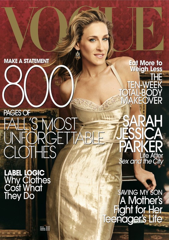
1. I cropped the photo to fit my requirements for the cover. I chose this image due to the well-balanced lighting, combined with the model's position in the frame and her expression, which is a convention of front covers of magazines such as Vogue and Elle. However, most of these image took place in a studio controlled environment, where the light and temperature were under control, I chose to subvert this convention in order to create add personal flair and style to the magazine, and design a cover adhering to the ideologies of my brand, making it stand out against its competitors.
|

|
2. I retouched the skin using the spot healing brush tool, patch tool, clone stamp tool and sharpen tool, since I found through my research that clear skin was common in other competitor magazines. So I adhered to the western conventions of beauty, giving the model blemish-free skin.
|


|

|
3. I them used the Liquify filter in order to make my model more conforming to western beauty standards:
|

|

|
4. I masked out the flyaway hair by using select and mask, spot healing brush tool, clone stamp tool and patch tool to make the model look put-together, elegant and in control.
|


|

|
5. I added hue/saturation to a mask of the face and body (the foreground), in order to reduce the model's natural redness, increasing the reds saturation by +2 and hue by +3. This gave the photo a more refined and professional look. I also used the blur tool to make the background less clear, allowing for the model in the foreground to stand out more.
|


|
Step 6:
Finally, I added a hue saturation to the background (everything except the model), increasing the Greens saturation by +40, and lightness by -24; the Blues hue by -27, saturation +18 and lightness +25.
|


|
Step 7:
I added the masthead over the model, since in this issue the brand name would be more likely to sell the magazine rather than the model in the main image. I chose to use a golden shade of yellow, which gave the impression of luxury and summer, the latter matching the date of the publication: July. |

|
Step 8:
Next the issue date of July was placed underneath the masthead, as this is the most common place for the date of the publication to be put, according to my research. I chose to place this in the top right corner of the cover because the target audience would read from left to right, top to bottom; so the audience would notice the date easily. |

|
Step 9:
I added the largest coverline, this would be the first one to capture the eye of the reader. I chose to make this coverline more eye-catching than the anchorage text because through research I found this to be a common trope in recent issue of Vogue magazine, often when the magazine contained seasonal fashion articles, for example the "fall issue", "winter issue", etc. I made the serif font italics, to create a more distinctly feminine aesthetic adding to the cursive and soft edges of the typeface. |

|
Step 10:
I added the rest of the coverlines, making the font bold, and carefully selecting which sidelines positioned on the cover would look good in yellow. I had to place them strategically so that the colour was somewhat evenly spread across the cover. I changed the justification of the cover lines since it was a common trope of recent Vogue magazine covers. Moreover, I had a variety of typefaces, two in particular that I altered by making them fully capitalized or italics or a combination of both. This gave the cover a more diverse appearance, connoting to the audience that they are getting a diverse array of content, and thereby bang for their buck. From my research I found the best possible placement for my coverlines was surrounding the centre of the main image, so that the model would be correctly visible along with the text. I chose white for the cover lines' font because it stood out against the darker background and also was part of my colour scheme, creating a cleaner and purer look; I also added a drop shadow to the text to make the white contrast against lighter parts of the image, like the light blue sky. |

|
Step 11:
Finally, I added the anchorage text. Here the rule of three is evident when it comes to the colour scheme, the yellow has been spread evenly across the cover: the masthead, cover line and anchorage text. This creates a more pleasing aesthetic for the reader. I capitalized the anchorage text in order to emphasize its importance to the target audience, also making it stand out from the other cover lines. |
